Project Title:
Holmes Digital PresenceProject Scope:
Creating an accessible, mobile-friendly website to display positioning instructions for Holmes’ Ultrasonic HumidifierProject Timeframe:
11/10/2021 - 11/22/2021. This project was developed as part of my COM424 (Document Design) class at Illinois Tech, in Fall 2021.Design Tools / UX Methods Used:
Figma, A/B Testing, Google Drawings, Content Strategy, Technical Writing, BrandingUX/UI Designer:
Angela Petrone (me). Individual projectFinal Product:
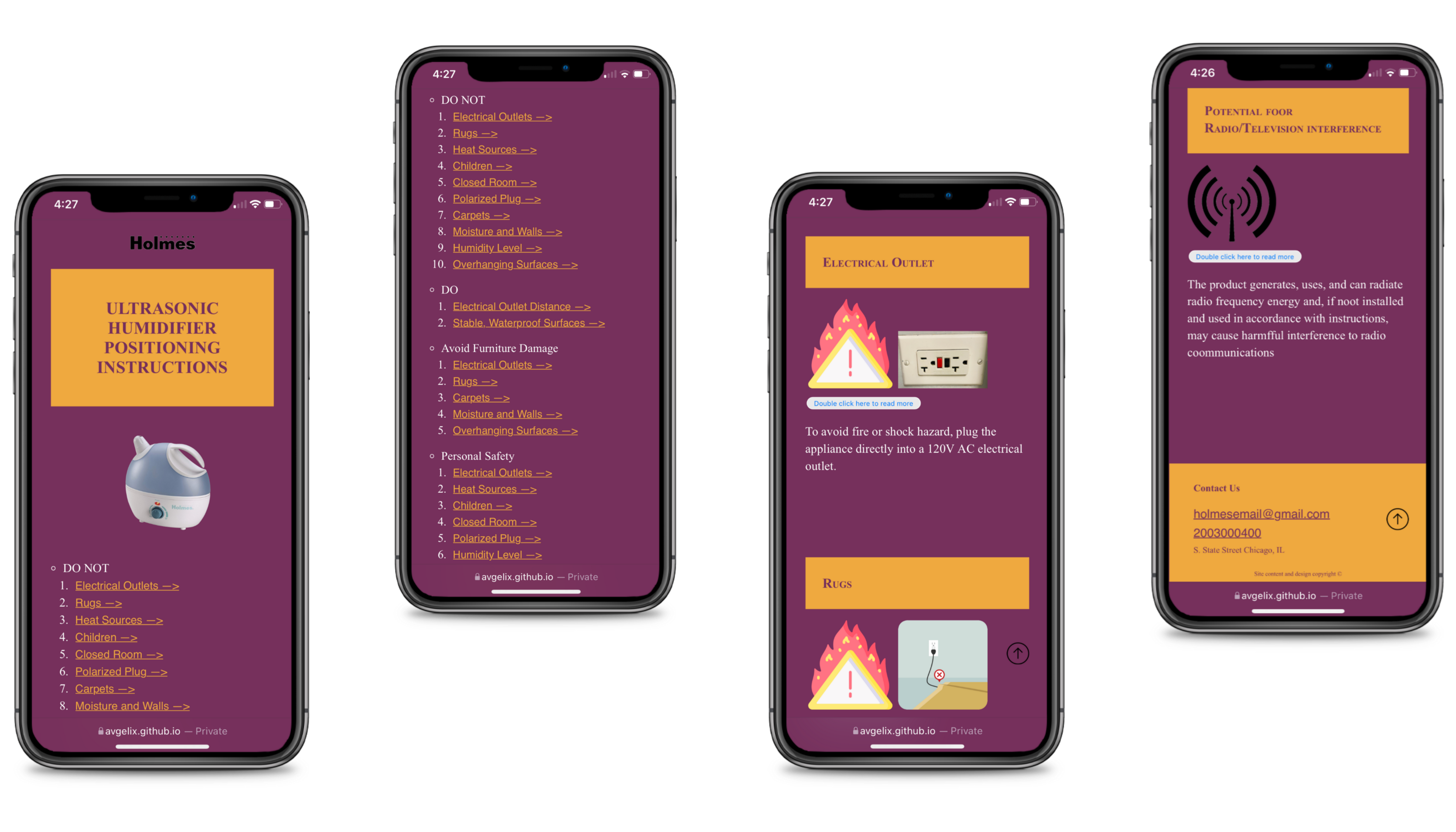
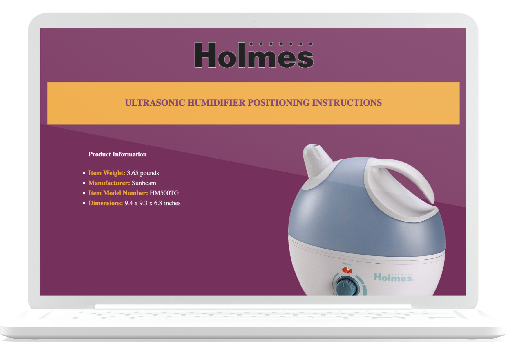
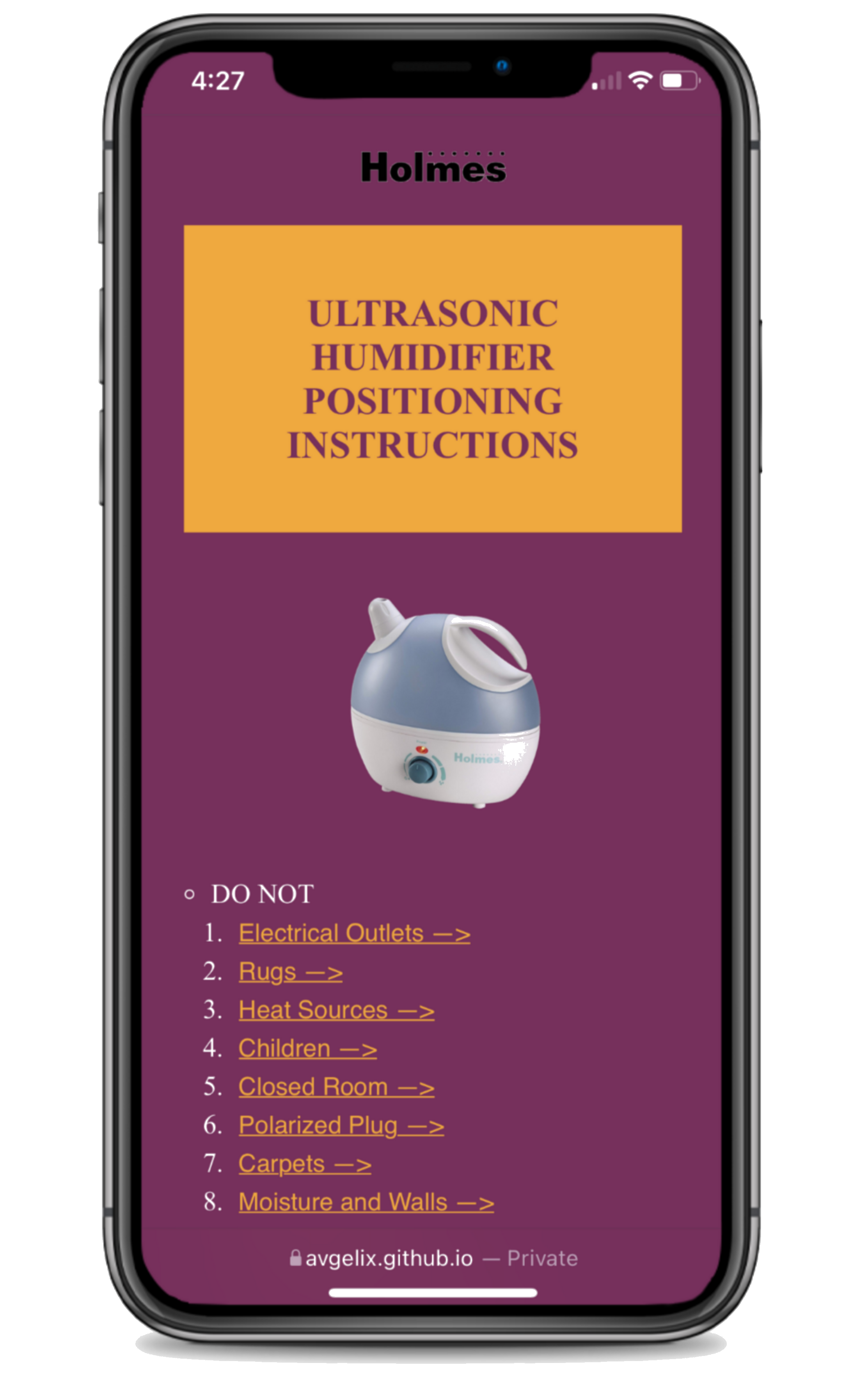
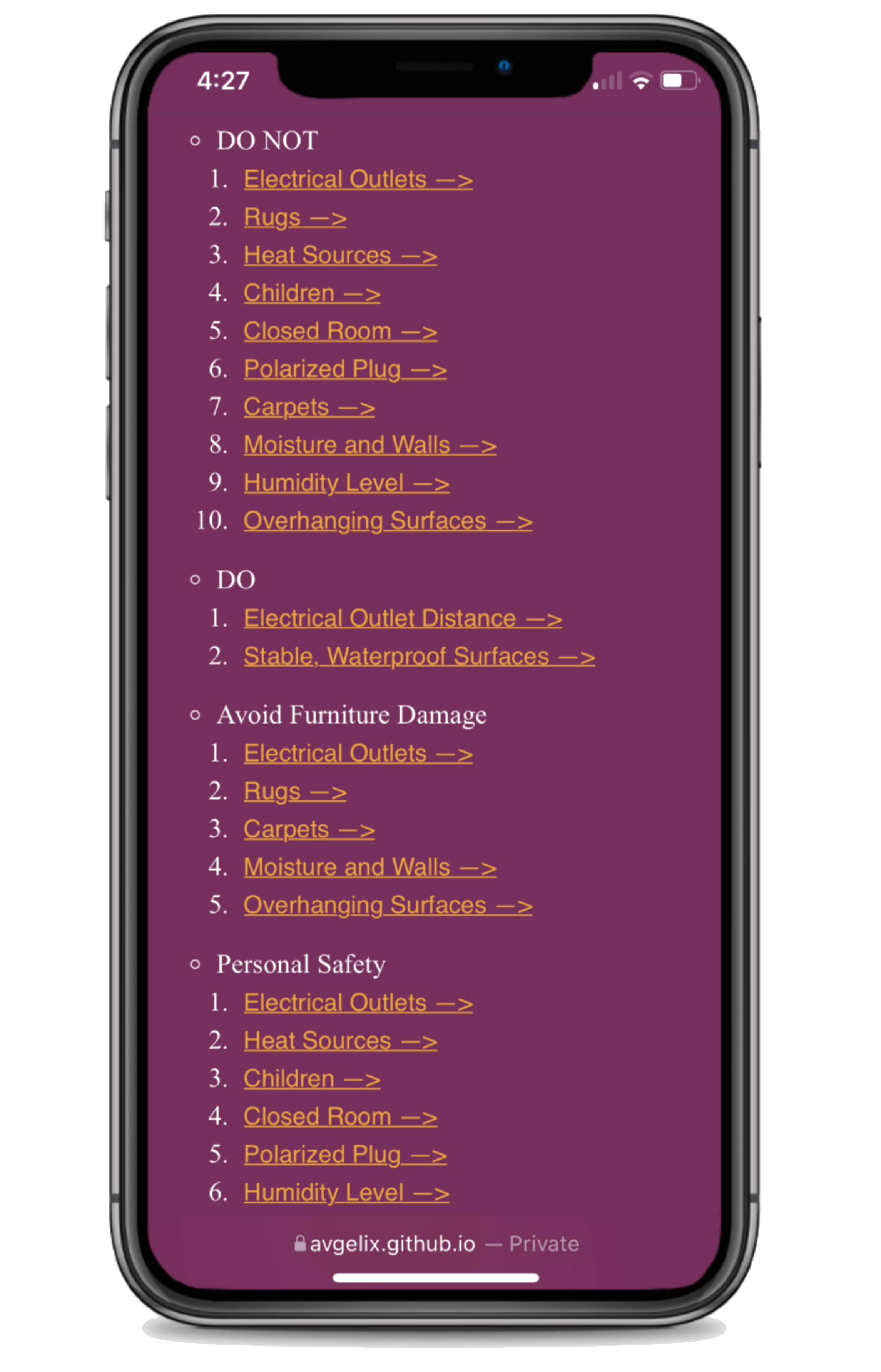
Ultrasonic Humidifier Positioning Instructions website
Project Summary
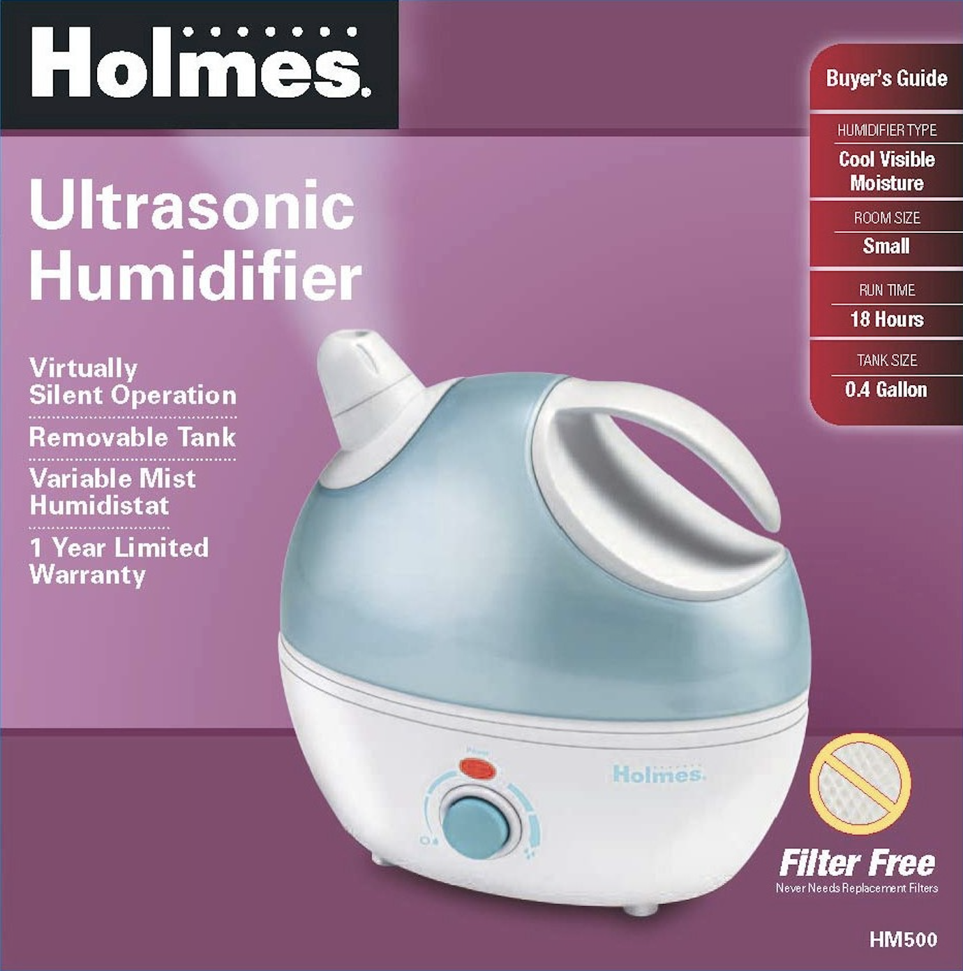
Holmes is a company that produces home-related products. My aim was to make the positioning instructions for one of Holmes’ products accessible digitally, maintaining Holmes brand identity and preserving the original copy provided on paper-based instructions for the same product. I conducted this project on my own.
Research & Design Process
- Firstly I looked into Holmes' brand identity. In styling the website
I respected the typographic and graphic choices that make the Holmes brand distinguishable.
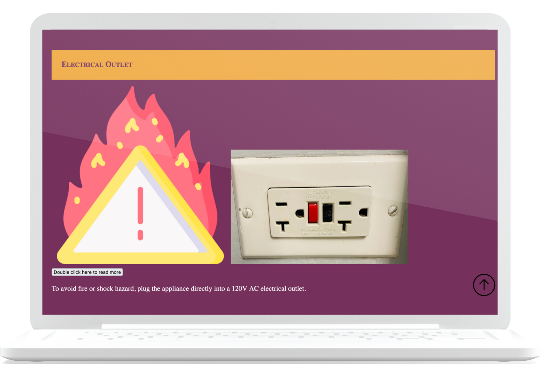
The website I developed aims to make the positioning instructions for one of Holmes' products more accessible. The website can be accessed by users with different needs and impairments. It doesn’t require reading, and the positioning process is guided by icons or simple pictures. - Next I reviewed the information available on the paper-based instructions, selecting the content that would be most relevant to creating instructions specifically aimed at positioning the product. Afterwards, I focused on the colors and fonts that would match Holmes well-established brand identity. I created a stylesheet including these essential elements.
Competitive Analysis
- Websites providing instructions are varied in essence, so I conducted
research on two relevant competitors in the home products field. In particular,
Ikea’s instructions
served as a basis for me to understand the importance of having minimal, non-ambiguous and easy-to-understand icons in my final version of the instructions. -
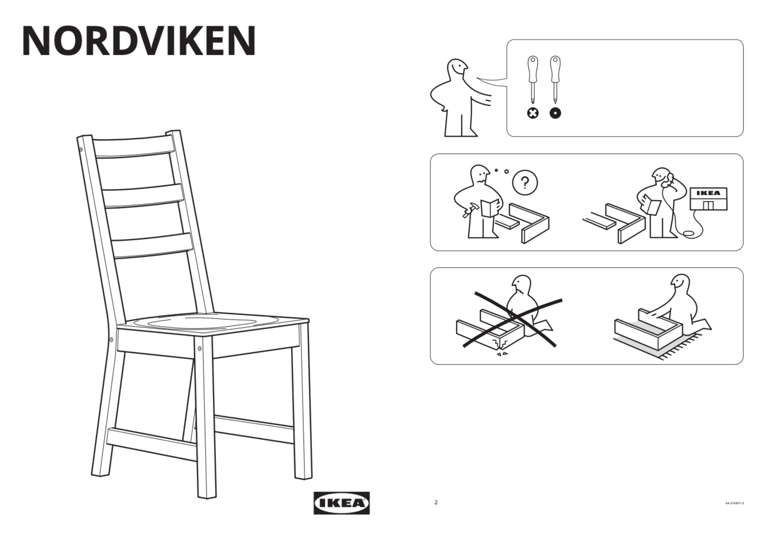
- However, I also looked into
complaints about Ikea's instructions,
which proved that staying minimal and entirely visual, while necessary to accomodate the needs of a diverse audience, is probably not the best possible way to approach a website entirely dedicated to instructions.
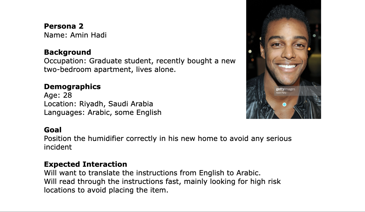
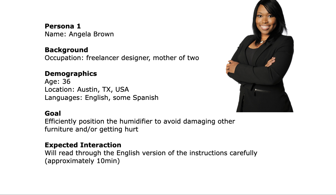
Personas
- I developed two user personas on which my work was based. The two profiles provide an overview of two general categories that I identified as potential users of the intructions. The two personas below have their differences, especially with their time availability in an inverse relationship with the possibility of them misplacing the item.
-
Iconography
- Following best accessibility practices I decided to build the website in a way that even without reading a single word one could benefit from the instructions, while making written descriptions of each step available with one click. I chose minimal icons that disambiguate the tasks users are required to perform to position the product effectively and safely. The icons were picked from free-stock png websites. Some of the icons were also subsequently modified by me using Google Drawings.
-

-
-

-

Development
- The website is fully translatable.
One pain point of the paper-based version of Holmes instructions is exactly that of not being universally understandable,
as only a finite number of languages can be provided. A digitization of the instructions allows for increased reach and accessibility. -
- I had two people testing out my website before reaching the final stage of the product.
I coded this website using HTML, CSS, and Javascript.
In particular the
progressive disclosure
of content was possible thanks to the JavaScript functions I wrote
User Feebdback
- I used
GitHub
for version control and worked on several branches to keep working while my website was being tested by two users on GitHub Pages. - Given my time constraints I was only able to gather feedback from two users who were available and correspnded to my two personas
- The first user a 40y.o. woman had to translate the entire website from English to French and Italian. She helped me understand if there really was an increase in accessibility thanks to the digitization of the instructions. She also had the time to read the copy and found the organization of the index at the top of the page extremely helpful.
-
-
- My second user was a classmate,a 20y.o. woman. She didn't need to translate and didn't spend more than 5 minutes on the website, mainly scrolling through and making me understand if the icons I had chosen successfully disambiguated every task.
Learnings
The most challenging part of the project was building the website in a way that reading was not essential to the user experience. In the process of following instructions users are in all sorts of mental states and physical conditions. Making the website as straightforward as possible was a necessity, but providing additional text for those users who want to spend more time and increase the accuracy of the positioning task was also essential to the project.